STAY REBELLIOUS ZINE - 2018
CONTRIBUTIONS: GRAPHIC DESIGN | PRINT DESIGN | ICONOGRAPHY
MEDIUM: PRINT
TIMELINE: 2 WEEKS
THE PROBLEM
Why make a Zine about Music?
I love music. And I mean that genuinely. I will listen to everything from experimental lo-fi to disco punk to progressive metal to jazz fusion. I have been performing music since I was 9 years old with the flute being my first learned instrument.
As a love letter to music I created a radio show at my college radio station called Get the Punk Out: a collection of broadcasts discussing various genres of alternative music. I’ve talked about genres like Funk, Art Punk, Goth Rock, Shoegaze, and Bounce.
I end each broadcast with the tagline "Stay rebellious," which I felt I needed to incapsulate into a product.
Why a Zine?
Zines were the original music social media for alternative teens! Through the late 20th century, it was a way to share information about music and communicate ideas before widespread access to the internet.
Creating a flow for print is a similar process to creating flows for digital applications too. There are just different rules!
Why this Aesthetic?
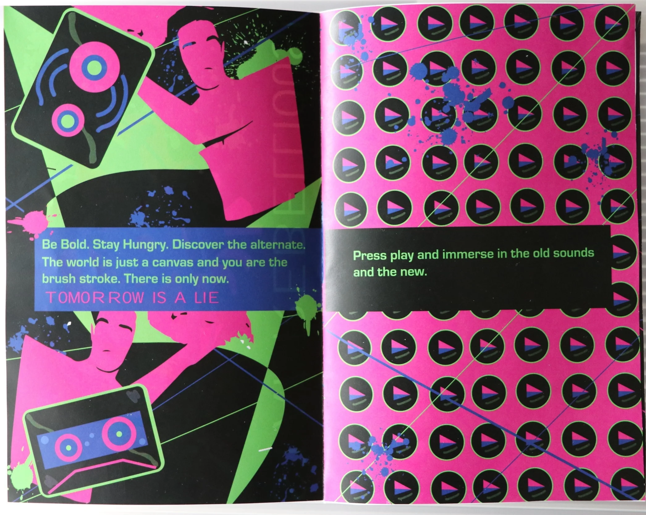
My goal was to combine the influence of the DIY handmade aesthetic with the neon bold vision of retrofuturism. Combining the two felt almost wrong to me which fit the rebellious nature of the zine.
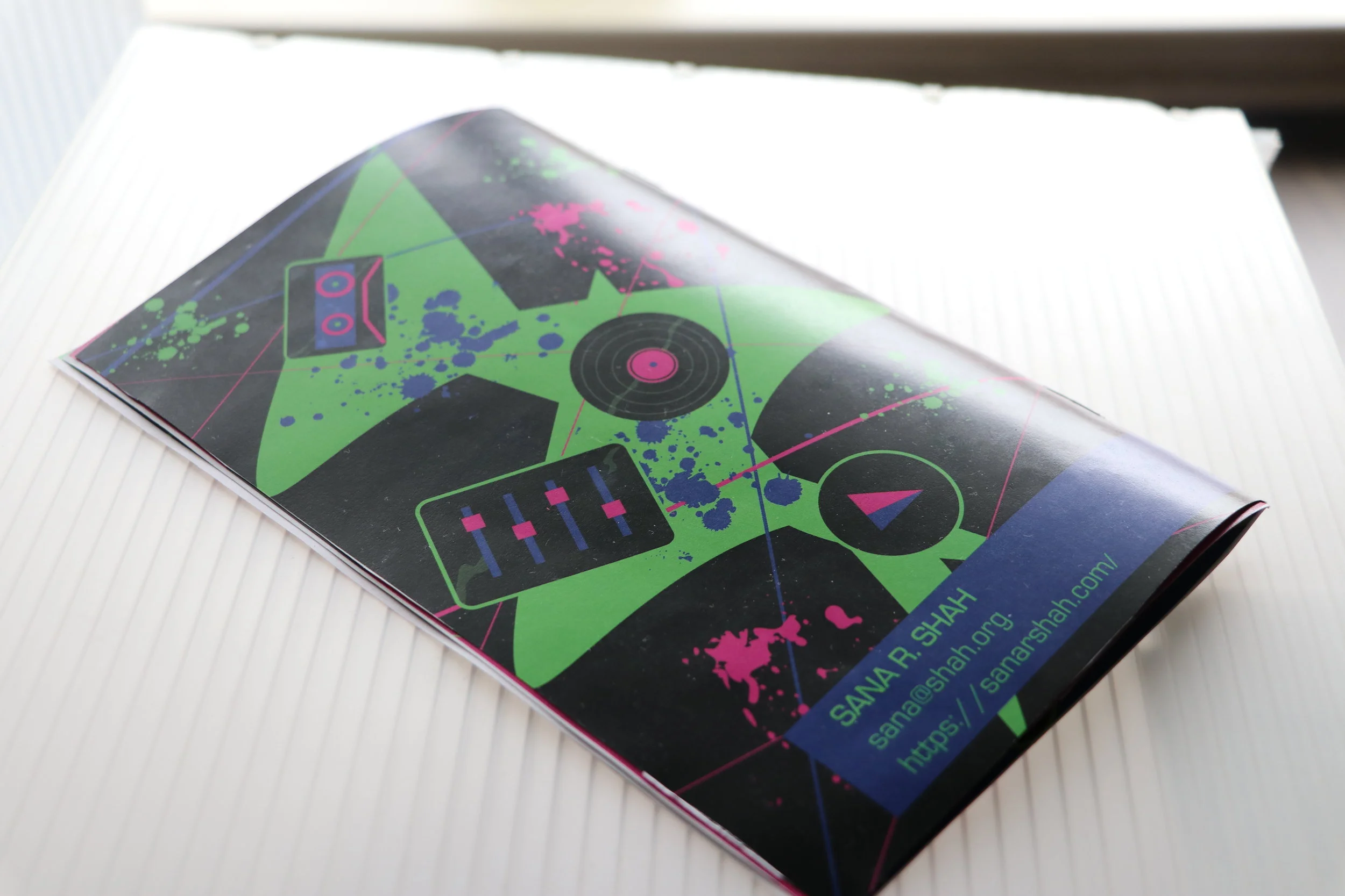
I incorporated a redesign of my music icons to fit the retrofuturist look as seen below.

Retro music icons designed by yours truly!
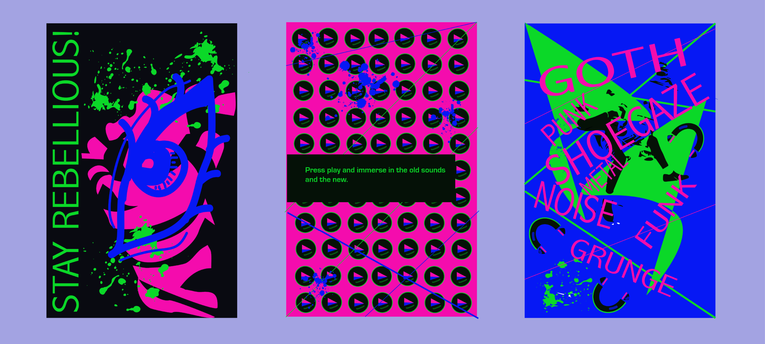
CREATING VISUAL PATTERNS
The use of the icons provided pattern and consistency to the zine. It also helped me to decide how to approach the color palette with their bright colors.
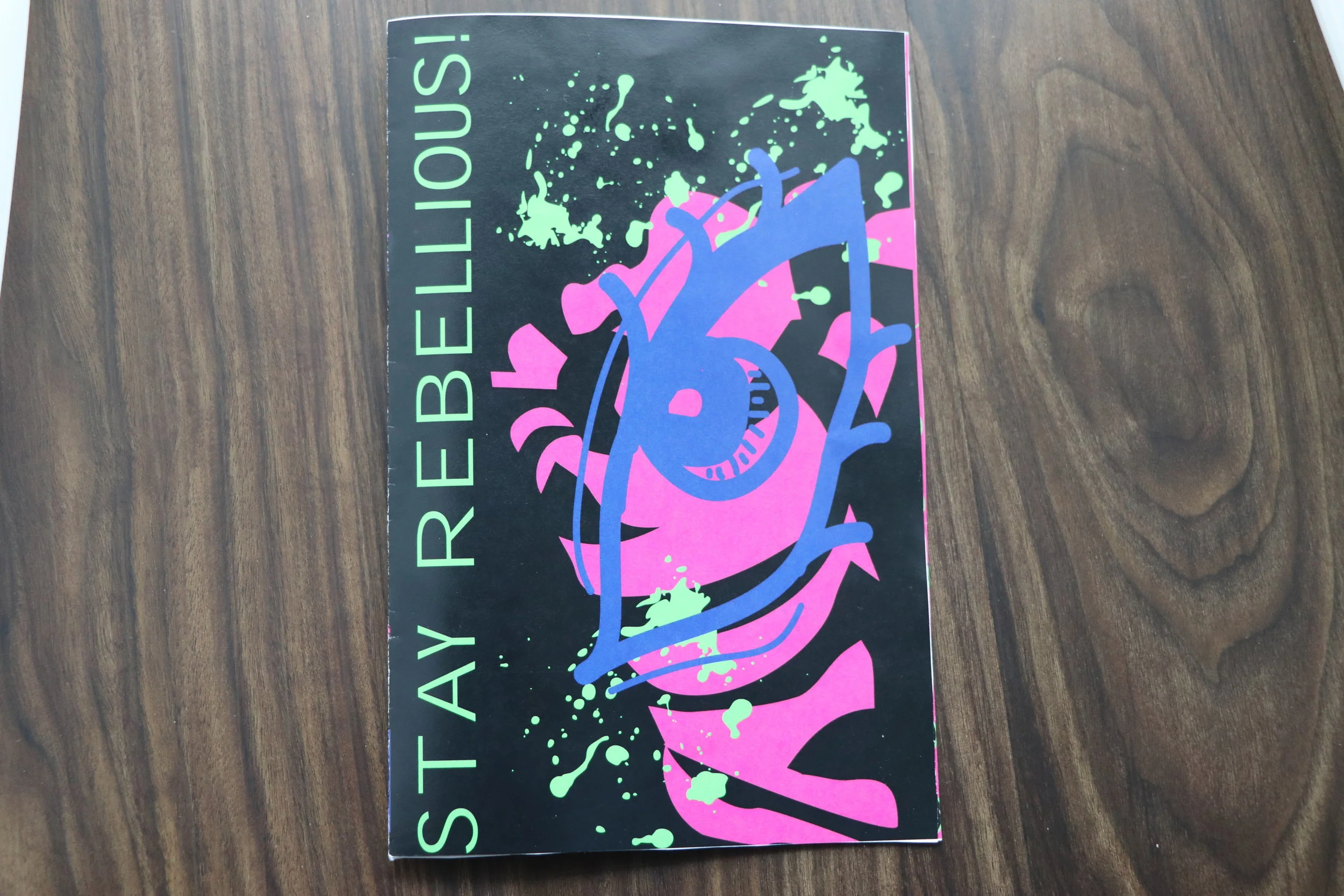
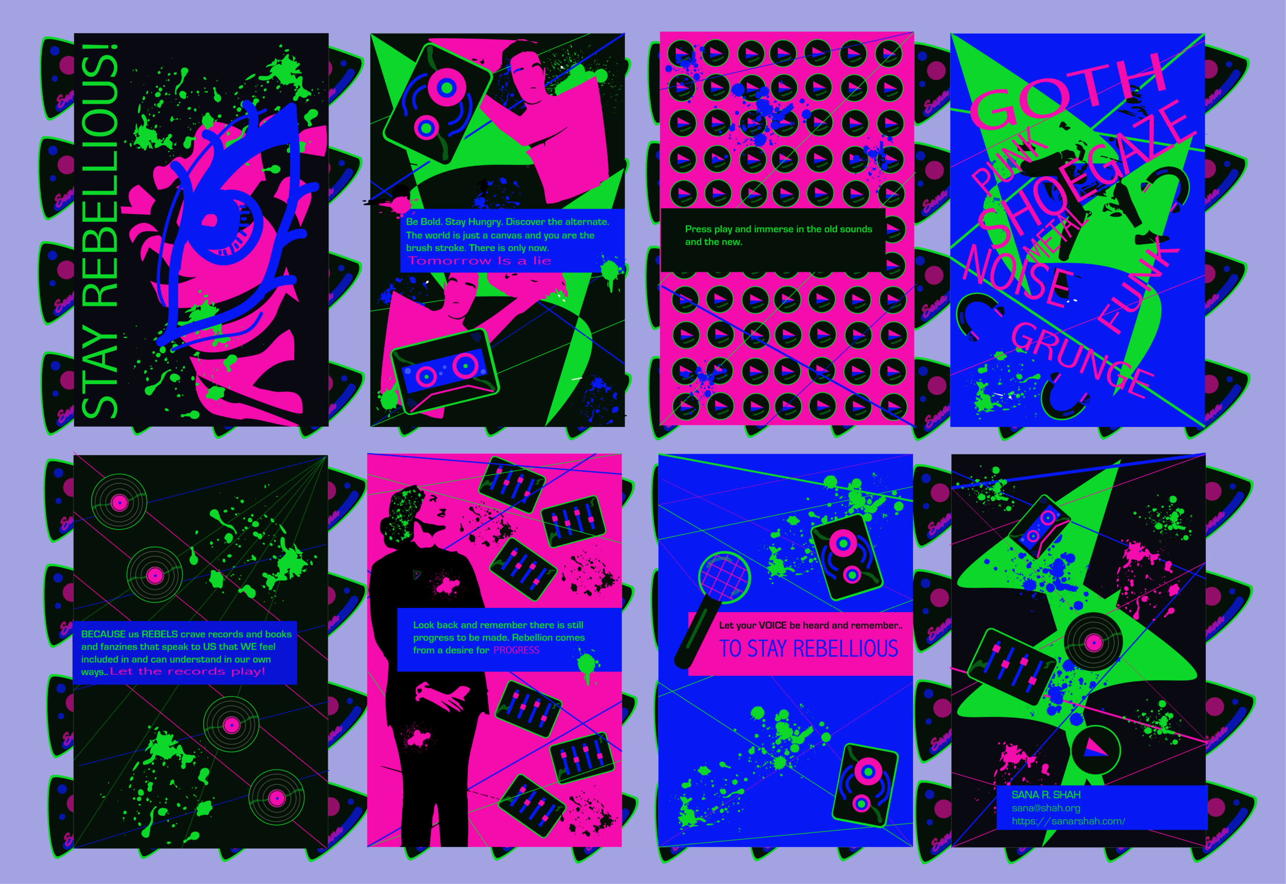
The front cover of the zine with influences from Riot GRRRL punk zines and a retrofuturism-esque color scheme.
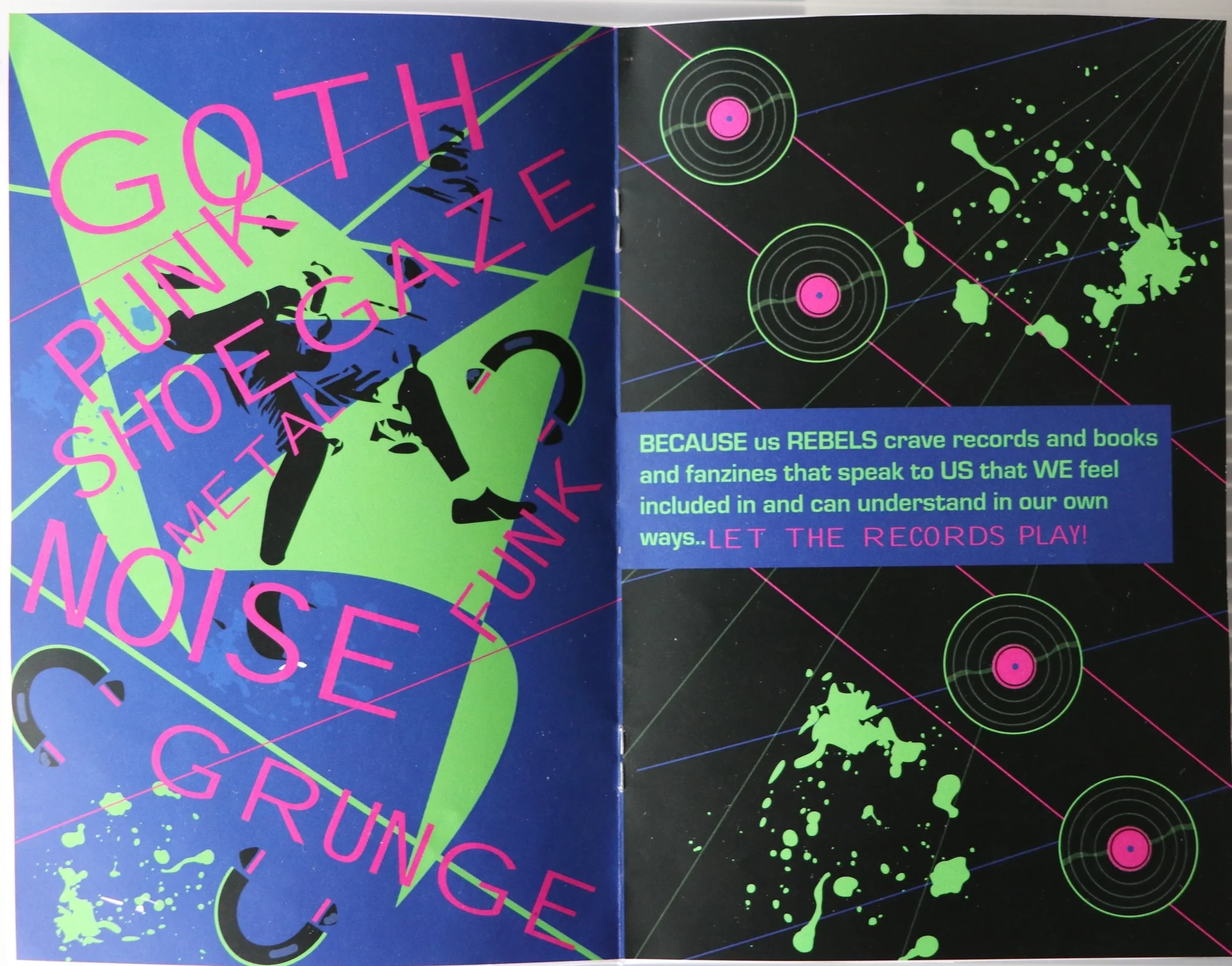
Photos of punk musicians like Fugazi, vector lines, distorted type, and ink splatters were liberally used throughout the page layout.
I chose the bright green, blue, and pink to draw from the RGB color scheme found in many of the old games and media in the 1980s.
The pink stands in for the red as it is not as garish but is still bold.
It also brings a femininity to the zine, which adds to how I evoked a lot of the Riot GRRRL manifesto within the text and re-contextualized it for rebels rather than solely women.
CHALLENGES
Some challenges with this project were coming up with a different layout for each page in order to keep the zine visually interesting.
I was able to overcome this by taking both inspiration from zines during the punk and post-punk era as well as using the shapes, photos, and icons I had at my disposal to inform the flow of the page.
REFLECTION + TAKEAWAYS
I have a huge appreciation for print as a medium and have some takeaways how to think about the user flow in a different way.
Page Flow - When designing the flow a physical page on paper as opposed to a digital one, attracting the eye at multiple focal points is important to keep the reader engaged.
Accessibility - Accessibility in print is still important! Even though I used bright colors, there is still enough contrast for a user to read the content.