
ALTERNATIVE FEATURE TEMPLATE
ROLE
User Experience Designer, Washingtonian Magazine
CONTRIBUTIONS
User Experience Design
MEDIUM
Desktop
TIMELINE
Nov 2019
THE PROBLEM
Washingtonian Magazine reports on the ins and outs of politics, culture, art, events, and the who’s who of the D.C. area. Working on a monthly digital and print magazine comes with a few sets of challenges. The art, editorial, digital product, and advertising team all work in tandem to produce the full magazine. One of our biggest forms of coverage is our feature stories, which writers and editors can structure and create with ease thanks to our feature template that we built to fit editorial needs. At the time our feature templates were most suited to photos with landscape cover images. We could use portrait images for cover stories but they would have to be embellished in some way to take up the same size as a landscape photo.
The problem is these solutions would require extra labor from the art department, particularly the photo editing team, who by this time were working on photos for next month’s issue and content.
Below one can see the examples of photos that were given extra visual elements in order to keep the image landscape for feature stories.

Feature story on Britt McHenry
WHY DOES THIS MATTER?
These solutions are visually appealing but it would take away time that the Photo team could spend strategizing and working on future ideas because they were spending time retouching photos from past issues of the magazine for a digital rollout.

Feature story on Ralph Nader
WHAT WAS ALREADY WORKING?
Before diving into a solution, we wanted to make sure we knew what was already working so as not to create roadblocks for our Web Producer or Art Department in the middle of digital feature production.
We knew that if a photo was already a landscape photo, there was no additional labor that needed to be done. That experience would not need to be changed.
We knew that the experience on mobile would not need to be changed so as to keep the headline and dek readable in addition to keeping the photo visible.

Mobile experience for Britt McHenry story

Mobile experience for Jose Andres story

Desktop reading experience for Covid Morgue story, which is already a landscape cover photo.
THE SOLUTION
Now that we knew exactly what we needed to work on, my manager and I spent some time brainstorming how to best showcase portrait photos. Ultimately, we mocked up the portrait image to still feel “above the fold” and at the same time feel like a magazine page. Below is the proposed design for the alternative feature template.

We were not alone in this solution. Publications like The New York Times were also doing something similar with their feature stories.

FEEDBACK + THE LAUNCH
When we showed the Art and Editorial department our solution, they were elated at the amount of time that would be saved. We no longer had to have whole meetings and extra work hours dedicated to resizing or embellishing portrait photos. The only change requested was to make the size of the dek a little smaller so that the headline would be highlighted. Once that change was made the new template was rolled out.
You can see it in use on stories like the Poker Brothers feature or our coverage of the Trump Hotel.
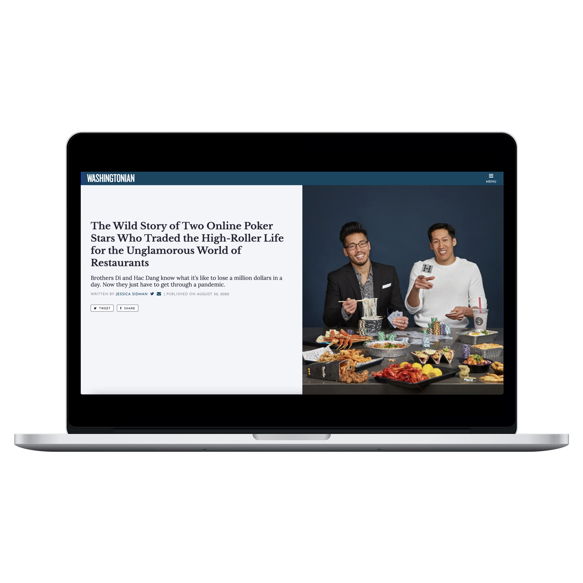
Alternative Feature Template in the Poker Brothers Story

Alternative Feature Template in the Trump Hotel Story
REFLECTION + TAKEAWAYS
Simplicity can be the best solution. Our solution was a small change in making images with a 4:3 or less ratio transform into the alternative template. We did not change the mobile experience nor the experience for images with a greater ratio.
THE IMPACT
Saving Time. During meetings for digital features, little time is spent discussing how to reformat photos for digital rollout. More time is spent strategizing on ideas for future magazine issues and digital rollouts.
A Better Reading Experience. We have gotten feedback from readers on how the new template feels a lot like a print magazine, which is both nostalgic for readers in our older demographic and visually appealing for readers in our younger demographic.