
QREEK EVENTS BRANDING
CONTRIBUTIONS: BRANDING GUIDELINES | BRAND IDENTITY | USER INTERFACE DESIGN
MEDIUM: DESKTOP | WEB STYLE GUIDE
TIMELINE: 2 WEEKS
*This is a freelance project. I was the sole designer for this project and interacted with the two co-founders of the product.
THE PROBLEM
What is QReek Events’ story?
QReek Events described their inception as,
“QReek Events is the result of a number of iterative improvements on a digitized, fast check-in system that prioritized guests' safety while maximizing their time in attendance at your event. My sorority switched to using Google Sheets when pencil and paper just wasn't cutting it, but when that still proved to be tedious and inaccurate, the idea for using QR code tickets was born. QReek Events is a way of sharing this guest coordination system for events with any other organization that is interested in such an application.“
The team wanted help with rebranding the product’s visual identity in a way that was consistent with their values and story.
Mapping Trends
Some key words I noticed that the QReek Events team used when describing their product were:
Safety
Accessibility
Community
Maximizing enjoyment
The Current Site
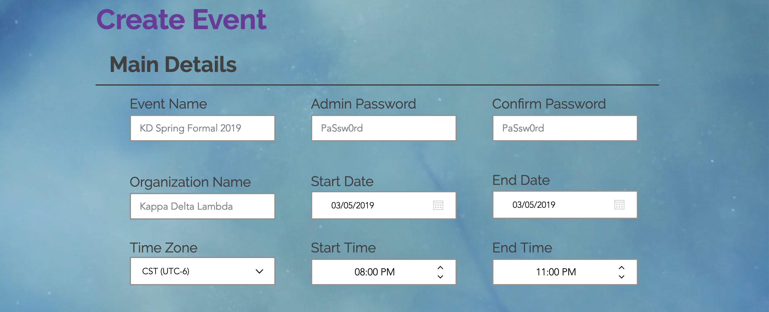
The current website is manifested as a simple landing page with the ability to find or propose new events in order to create the unique event identities through a form. There is also an about section and an FAQ page.


What can be improved?
The background, while a beautiful gradient, can make the dark grey text hard to read. There is also inconsistency within the use of the fonts. Noticia Text is used sometimes as a header and body font while there are uses of Avenir and Arial all throughout the page but in no hierarchal order.
CREATING A VOICE
I began drafting a style guide to help the founders maintain a consistent voice and brand for their product.
Type
One of the first elements I approached was the fonts used on the website. Below are the final fonts for the primary display face and content face.

Playfair Display Bold: This font is elegant and bold but still modern, reminiscent of the sort of classic atmosphere associated with sorority and fraternity galas and formals.
Noticia Text Regular: This font is fun and modern. The unique slabs give it a sense of quirkiness often reminiscent of college newspapers and event flyers.
Colors

The final shades in the color palette can be seen above. The main colors are muted purple, cerulean, and pale gold. Each color represents a different value of the QReek Events brand.
Muted Purple - This shade of purple feels like a harmonious blend of many shades of red and blue. It represents the diversity of community. QReek Events hopes to be used by many organizations as an efficient check in system.
Cerulean - This is the most vivid color of all the swatches. It represents the value of vibrancy; showcasing how college events are spontaneous and fun.
Pale Gold - We often equate the best of something being the gold standard. That is why this pale gold represents the value of safety. QReek Events, above all else, wants to instill its users with the confidence of having safe check in.
Why these style choices (as opposed to others)?
Fonts
I originally tried to keep the Noticia Text and Avenir font combination that I had found in the current version of the site. However, Noticia did not feel strong enough to be a primary typeface. That is when I started looking into other modern serif typefaces and settled with Playfair.

Colors
I played with two different color palettes before settling on the one used for the final style guide. The color palettes below were my initial explorations in creating a uniformed color palette.
These colors however, did not represent the values of the product to me. The pinks were playful but did not represent community. The beige and browns were too neutral to represent safety.
I then went back to the original website and looked at the colors used. I then modified those colors slightly and found that each color had a purpose in representing the value of the product (as explained above!).


Ecosystem of Style Guides + Design Systems
Since this product is in its infancy and does not have the functionality that would require a design system, I stuck with creating a style guide.
I took a lot of inspiration from minimalist style guides. I also made sure to see how each guide addressed the seven elements of brand identity that were important to this project:
Brand Story - what is QReek Event’s story?
Logo - what is QReek’s symbol to the world? How does one use it? How does one not use it?
Voice - what words and language are important to telling QReek’s story?
Color Palette - what colors enhance the identity of QReek? How does one use it? How does one not use it?
Typography - what type represents the identity of QReek? How does one use it? How does one not use it?
Imagery - What images are on brand? What images are not?
Website - How do these elements look on the website? How should they not look?
Below are some of the style guides I kept as a reference when creating QReek Event’s guide.


I also took inspiration from larger graphics manuals like NASA and the New York City Transit Authority. Even though these guides have exponentially more content and fell into the realm of design systems, I found them helpful to see how a brand manual could expand beyond the basic elements of brand identity. For example, NASA has specific logos used for specific models of rockets, which I found very interesting.


The Final Style Guide
Below is the final style guide presented to the QReek Events’ team.


CHALLENGES
I had never created a brand identity on my own before.
It was also a challenge refining the user interface design of the website to ensure that the style guide was properly used in the final site layout.
RESOLVING CHALLENGES
I really dived in and did research on what the standards were for style guides and made adjustments based on my knowledge of what QReek needed.
I would also make sure to keep open communication with the team to ask questions and receive feedback.
I would send my idea of what the website should look like and receive feedback.
I would focus on optimizing the current website’s functionality such as the event search bar, create event button, and feature information and think about how they could best be placed on the website in addition to feedback from the QReek Events team.


REFLECTION + TAKEAWAYS
I have a huge appreciation for designers who create style guides.
Deliberation is key. - One cannot be arbitrary when selecting colors, type, or choosing the voice of a product. There should be an explanation for every choice made within a style guide.
Leaving room for growth. - If QReek Events decides to expand their services or on this service in particular, I tried to make sure that my style guide left room for exploration and flexibility so that the style guide could grow with the product.
