ORR OVERSIGHT DASHBOARD - 2018
CONTRIBUTIONS: INTERACTION DESIGN | UX DESIGN | USER RESEARCH | DATA ANALYSIS | INFORMATION ARCHITECTURE
PLATFORM: MOBILE | DESKTOP
TIMELINE: 2 MONTHS
*I was the sole product designer on this project. I worked with the Chief Advisor to the Data Office, Data Office team, and various government component subject matter experts (Office of Inspectors, Office of Evaluations).
BACKGROUND
The Department of Health and Human Services’ Office of Inspector General (HHS OIG) created teams to audit ORR (The Office of Refugee Resettlement) facilities housing undocumented alien children (UACs) including some separated from their families. The issue was that investigative teams were receiving a lot of data concerning the facilities but had no tool to make sense of the data.
*You can read more about HHS OIG’s involvement here.
After much deliberation, research, and synthesis, our problem we were trying to solve was:
How might we design a dashboard that provides context to the data for teams entering facilities?
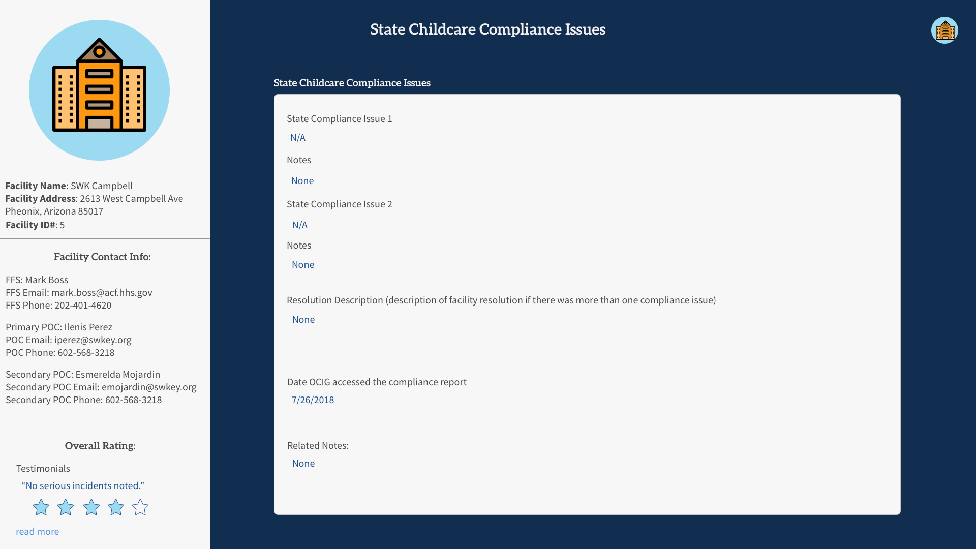
High fidelity prototype of the ORR Oversight Dashboard Profile
DISCOVERY: WHAT PROBLEM WAS HHS OIG TRYING TO SOLVE?
During the second half of my Coding it Forward Fellowship with HHS OIG, I was brought in to help our data office to try and navigate some recent events that had taken place. The Office of Inspector General was tasked with creating teams to investigate the ORR (Office of Refugee Resettlement) facilities in order to review the conditions of the facilities as well as the care being given to the children.
Who were we solving this problem for?
When I was first brought onto the project, I was tasked with figuring out how I, as the sole designer on the team, and the data office could provide a service to the teams doing the inspections.
Who made up the teams?
The teams consisted of:
Lawyers
Auditors
Evaluators
Inspectors
Below are the personas generated after interviews.
HHS OIG was receiving a lot of data from initial study documents that came from ORR but did not have a set of next steps for what to do with all of these data points.
What was the users’ goal?
Their main goal in this oversight project was to examine what challenges facilities were facing in regards to the physical and mental care of the children in the facilities.
I recorded an investigator saying,
“I wish we could get some context when we went into these facilities! After the fact, it’s hard to relay everything we just saw.”
I gleaned that there was cognitive overload for the teams trying to process the information they saw in person and on paper. The first step question I asked myself after hearing this was:
What story is the data telling? How might we use that data to provide a service to the inspection teams?
RESEARCH: GAINING SOME CONTEXT INTO THE OVERSIGHT AND ANALYZING DATA
What kind of data was being sent back?
We were pulling data from both ORR and ACF (Administration for Children and Families) for initial study reports before sending in investigation teams to the field.
Each day we were getting updates from several hundred facilities with over 70 different data points that were used to describe the facilities. Some of the data points were logistical such as:
Facility Name
Facility Address
ACF Grant (if applicable) - ACF provides several different grants for these facilities
Number of Children in Care
Point of Contact Information
Other data points were more critical to the physical care of the children such as:
Total Beds in Reserve
Age Range
Number of Males in Facilities
Number of Females in Facilities
Number of Tender Age Children (children under 13 or with special needs)
The dataset can be seen below.
Lastly, there were the SIRs (Serious Incident Reports). These were written reports for any infractions committed within the facilities. These could be as minor as a child calling another child a name or as severe as an adult abusing a minor. The SIRs were broken down further with categories like:
Minor on Minor
Adult on Minor
Staff on Minor
Trafficking
The specific descriptions of the SIRs, in addition to data points like resolution descriptions and compliance, were qualitative but still very necessary to making sense of the full story surrounding these facilities’ challenges.
What pieces of data are most important to understanding the facilities?
I started documenting responses and compiled them into clusters where I saw trends as seen below.
IDEATION: WHAT TOOLS COULD WE CREATE?
The investigator’s words were a flash of insight for me. There was no tool that made sense of all of the quantitative and qualitative data that was coming through from the reports. This allowed me to refocus and cater my product recommendation to a concrete problem.
From the context of the reports, I saw that focusing on one facility at a time rather than all of the data holistically would be more useful to the investigative teams as well as making it easier to break down specific data points.
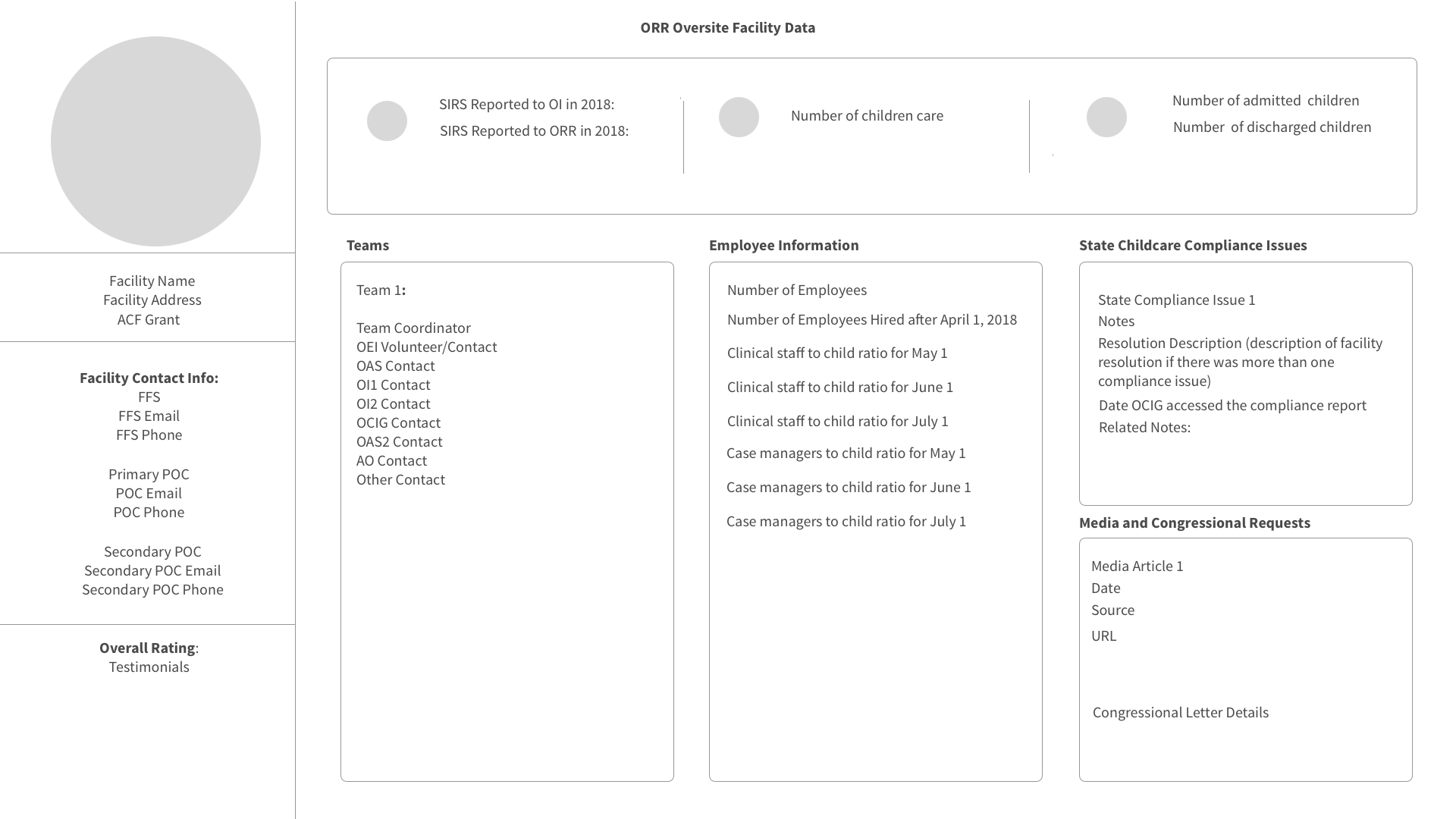
I began sketching out what a profile of each facility might look like.
Initial sketch of dashboard profile system
PROTOTYPING: BUILDING A DASHBOARD PROFILE OF EACH FACILITY
Initial Wireframes
Once I had a general vision of what the system might look like, from there I went back to my clustered data points and started sectioning out and organizing the data points. These screens became my initial wireframes for the dashboard profile.
Visual Identity + Working within a Design System
Afterwards, I began inputting real data points and adding visual design elements based on the U.S. Web Design System standards.
Populating in Real Data
I also began adding more screens that focused on the specific data points that were most important for the teams to see at a glance.
SIRs reported to OI in 2018
SIRs reported to ORR in 2018
Number of children in care
Number of admitted children for the facility
Number of children discharged from the facility
For example, I made an entire page dedicated to data surrounding information about children and the demographics that came in the reports.
Qualitative data like SIRs could be clicked on and expanded for detailed information if needed.
Mobile version of the dashboard profile
EVALUATION: REFLECTION, FEEDBACK, AND FUTURE ITERATIONS
How might we visualize qualitative data regarding teams’ observations?
There then came the issue of qualitative data that was subjective observations on part of the teams that were going out and looking at the facilities. This information was valuable because it gave a holistic story of the facility outside of the data points. This inspired the idea of a testimonials page where individuals on teams could input their observations that could then be coupled with a rating of the facility in addition to other data points and compliance reports.
Mockup of a testimonial page
Why does a Testimonials Page work?
Similar to reviews on a product page like an Amazon customer review, the testimonials give the user a quantifiable value for a product (the facility) made up of qualitative data. This feature would also be useful for the growth of the product should an issue like the mental and physical health of the children come up again. Investigative teams would have a backlog of information to look back onto.
What did we learn?
I proposed this product solution to the Chief Advisor to the Data Office who imparted me with these words:
This project was noted to be valuable for showing people who did not know what they wanted a clear direction to move forward
The testimonials page was given a lot of positive feedback due to the qualitative data giving a holistic narrative of each facility
What improvements can still be made?
A custom view when entering the dashboard for each role (Auditor, Inspector Evaluator, or Lawyer)
Have SNAP reports (software for uploading documents) reconcile into the dashboard so that there are no gaps in the data being updated
Potentially use the data to infer a ranking within facilities to see how close they are to being up to HHS standards
BONUS*
I presented about this solution as well as a few other projects with my fellowship for HHS Demo Day! You can find the presentation here.


