

MOODILIZE: WEARABLE AND DIGITAL PLATFORM
CONTRIBUTIONS: USER RESEARCH | CO-DESIGN | PRODUCT DESIGN
PLATFORM: DIGITAL PLATFORM (MOBILE/DESKTOP) + WEARABLE BRACELET
TIMELINE: 1 YEAR
THE PROBLEM
Music is a huge part of early development in children. It is often tied to early experiences and memories. At the moment, there are few ways for children to collect and visually understand the emotional information that their brains process. Apple Music does have a "safe mode" for parents to activate so that kids do not hear explicit music but there is no existing design for a digital platform for kids to recognize how they emotionally experience music. Adults can have generated playlists on Apple Music or Spotify based on their mood. No such service exists at the moment for children.
Why doesn’t a service like this exist for children?
Children do not get the same opportunity for curated mood based playlists due to the need for privacy with their data. There are also age limits for applications like Spotify or Apple Music so even if a child is able to listen to music on those applications using a parent’s or older sibling’s account, there is no sense of ownership over the account they are using.
When I was given the opportunity to collaborate with the Human Computer Interaction Lab’s KidsTeam at the University of Maryland, because of the organization operating as a research lab and under IRB research standards, I was able to interact, interview, and document the children and the subsequent qualitative data that came out from the sessions within this space.
DISCOVERY: WHY IS UNDERSTANDING THEIR EMOTIONAL RESPONSE TO MUSIC IMPORTANT TO A CHILD’S GROWTH?
Children grow up exposed to a lot of music. Some of this music is what is played on the radio and some can even be the music that their parents or guardian grew up listening to. At the ages of seven to twelve, children are going through cognitive development at a rapid rate in what is known by Jean Piaget, a psychologist who studied children’s cognitive development, as the concrete operations stage. This stage of development is characterized by classification, egocentrism, and concrete thinking.
Classification is characterized by the ability to group according to features. Classification is a large part of listening to music, whether it is picking which genre one prefers or how certain songs make one feel.
Egocentrism is characterized by the inability to understand the point of view of others. At this stage in their lives, children will be more concerned about their own needs, which is why a mood management tool for music works as a product for them. It is personalized to their different emotions, which validates their individuality.
Concrete thinking is characterized by the inability to see the intangible and abstract. While in the concrete operations stage, children are unlikely to understand concepts beyond what is in front of them and this includes complex emotions and the emotions they feel when listening to a particular song.
RESEARCH: CO-DESIGNING WITH CHILDREN
Prompt
Sessions with the KidsTeam typically start with a question of the day to stimulate their minds and prepare them for each co-design session. The prompt for my session was:
“Name a type of music that makes you feel happy, sad, or happy sad.”
This question addressed two points of cognitive development: classifying their emotions by identifying which music made them feel a particular way as well as moving beyond concrete thinking and into pondering their emotions. The “happy sad” emotion is particularly interesting because it is a combination of two emotions that normally wouldn’t associate with each other.

Interestingly, many of the boys stated that they did not enjoy listening to music (even though the KidsTeam researchers had seen some of them listen to music before). These statements might have an attempt to play devil’s advocate. However, for the rest of the session, we focused more on the emotional reflection and impact on the co-design session over solely music.
After each child went through their emotions, I also displayed my own form of classification with a playlist I created to foster empathy and discussion about subjective classification within music.
The children were curious as to why I picked certain colors. I answered that these were the colors I associated with the emotions I identified.

A spreadsheet of one of my playlists that I broke down by color and mood that I shared with the children on the KidsTeam
The children were curious as to how I defined certain colors to attach to a particular emotion. For example, they were curious as to why green was peaceful. I described it as having an affinity nature which evoked a peaceful mood for me.

One of the children made a comment about how they were fascinated by my use of color to express which emotions a certain song might have made me feel.
After this initial activity, children were split off into groups to complete the co-design activity. The groups consisted of one design researcher from the Human Computer Interaction Lab and two children. I walked through each group as a “floater” to get a chance to interact with all the groups and observe how they approached the prompt given.
Co-design Activity
After the children were split off into groups, they were given the following prompt:
“Design a technology that would understand your emotions through the music you listen to.”
The children were then given “bags of stuff” (bags filled with paper, cardboard, scissors, glue, markers, etc.) to begin prototyping their design ideas. Below is a group.

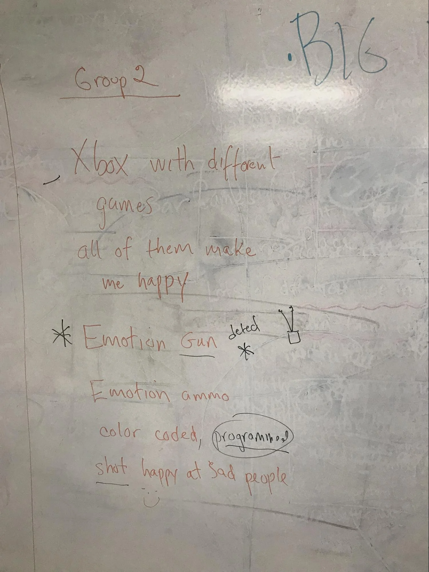
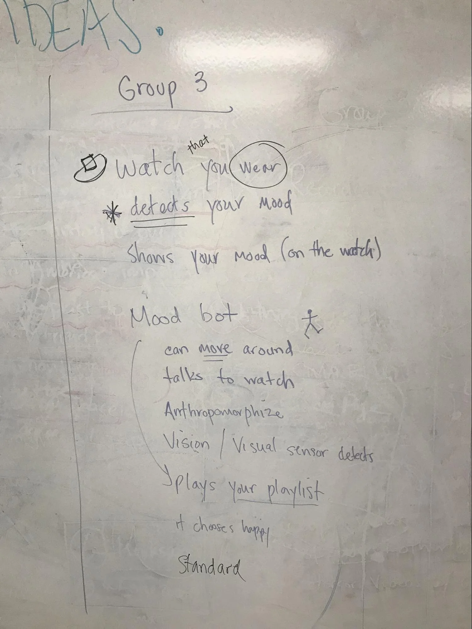
The groups spent about thirty minutes co-designing their prototypes. There were multiple design ideas from different groups including:
An emotion gun
A charm bracelet with mood based charms,
A mood reading watch
A mobile application on a phone that uses its camera to detect your mood.

The children then had 15 minutes total for groups to present their prototypes. Above is a group presenting their idea for a charm bracelet.
Debrief and Finding Trends
After we completed the co-design session and presentation of the prototypes, the other design researchers and I took some time to debrief some of our findings. We separated our notes into each presentation group and then looked for trends that ran across all groups later on. Below is the board with our findings and notes.

Some of the trends we found were personalization and physical technology, particularly wearables, tied to a digital platform. These notes of the trends were a catalyst in how I approached my own prototype for the group in the follow up session. Below are the notes for each group presentation.

IDEATION: INTRODUCING MOODILIZE
After the debrief, I began conceptualizing a prototype based on the data I had gathered in this first session. I decided to focus on tying the digital interface to a physical product.
Inspiration for Visual Identity
For the visual interface of the digital platform, I took inspiration from services and products made for children including Roblox and KiwiCo. Both websites make use of bright colors, bold readable fonts, and simple navigation.


Fonts and Colors
Below is the first iteration of the color palette and choices for fonts. I chose bright, vibrant colors to portray a childlike mood. The colors are all distinct for the different mood based playlists created for the end user. I narrowed three fonts that I felt would be readable for children.

I then refined the color palette based on what colors I felt best represented the moods that I had decided to focus on for the prototype including emotions like: peaceful, happy, angry, sad, energized, or unsure. These emotions were chosen based on their broadness and potential to be further explored after initial playlists are created. The emotions listed also have a simplicity that is understandable for children. I also narrowed down the title font to be Dosis for its roundness, which can be interpreted as modern and playful, and readability. I chose DINPro for content because it is a modern typeface and its thick strokes, which provides easier readability for a child.

User Flow
Once I finalized the visual identity, I went back to pen and paper and began sketching out what the user flow would look like based on my findings in my co-design session with the KidsTeam.

Sketching Wireframes
I then began sketching out wireframes for what the digital interface would look like for the end user.


PROTOTYPING: BUILDING A DIGITAL AND WEARABLE PROTOTYPE
What digital platform was best?
I started building this profile to be optimized for desktop. Since the average age for a child to have their own cell phone is around 10 years old (statistic from TechCrunch), I wanted to avoid excluding any children in the follow up session who did not have a cell phone from being able to use the application. In future iterations, I would consider making the application be cross platform to cover all bases.
Desktop Mockups
Below are the mockups of the prototype. The interface is bright, colorful, easy to navigate, and has large, easily visible buttons.
Homepage
The homepage showcases the different moods in colors that are representative of each emotion. The user can click on each mood button (or tap their charm on their bracelet) to generate the playlist based on how they’re feeling. There is also an option if a user is unsure of how they are feeling.

Unsure Flow
Below are the mockups for if the user is feeling unsure about how they feel. The user can choose two emotions to generate a new mood for a new playlist. The new playlist also generates a new color on the homepage.


Unsure Flow for None
Users also have the option to write their emotions out if they do not feel any of the existing emotions correspond to how they are feeling.


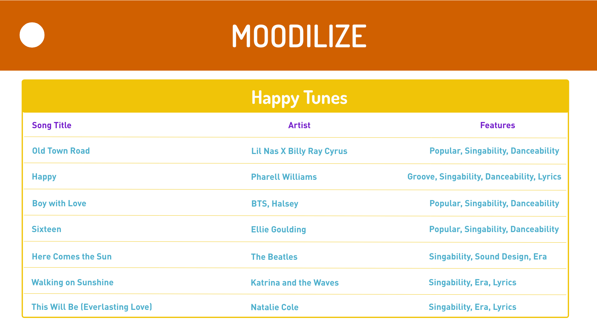
Below are mockups of what a generated playlist would look like. Features include song titles, the artist, and features for why the song has been included on the playlist. For example, danceability might be a more applicable feature to a happy playlist where sound design within the production of the song might attribute more to a reflective playlist.

Wearable Prototype
In addition to the digital platform, I designed three 3D printed bracelets that have paint in different colors for each of the “beads” to represent the emotions of the user.

Why a wearable?
I noticed a trend in my session debrief with the KidsTeam Lab of digital technology tied to physical objects. Wearables are accessible technology in that they are not bulky and are easy to carry.
EVALUATION: REFLECTION, FEEDBACK, AND FUTURE ITERATIONS
Following up with KidsTeam
After completing the prototype, I scheduled a follow up session with the KidsTeam to test and review the prototype I had developed. Below is a picture of one of the children putting on the 3D printed bracelet. Children participants were also able to test the desktop prototype because I had created an online link using Adobe XD. While they tested, they wrote down their feedback and design ideas on sticky notes.


Debriefing Testing
After we finished the test, we looked at the children’s sticky note session where they wrote likes, dislikes, and design ideas. We then began categorizing trends into their own boxes as seen below.


What did I learn from their feedback?
Children wanted to customize which color they associated with each emotion.
Children wanted to base the charms on more than color, they wanted different shapes and motifs to represent their mood.
Children wanted the application to be cross platform so that it is accessible from anywhere and for anyone.
Children wanted a deeper understanding of how the music could help them with why they felt the emotions they did and how they could use music deliberately going forward.
New Mockups Based on Feedback
Onboarding
The new onboarding flow allows for more customization including allowing children to choose their own colors for which moods they associate with.

Feature Context
When a child hovers over the feature section of their playlist, they can click on it and gain more context into why that feature might tie into a certain song, mood, and playlist. This allows children to have a chance to use their music deliberately.

Mobile Version
After validating with the children that they wanted Moodilize to be cross platform, I also prototyped a mobile version.


What improvements can still be made?
Discovering a way to safely add a social feature so that children can share their playlists with their friends
Wearable bracelet should be more customizable to the child (perhaps a “build it how you like it” model similar to the Pandora charm bracelets)
