
WASHINGTON PHYSICIANS DIRECTORY
ROLE
User Experience Designer, Washingtonian Magazine
CONTRIBUTIONS
User Research | User Experience Design | User Interface Design
MEDIUM
Desktop | Mobile
TIMELINE
Sept 2019-Jan 2020
THE TEAM
Washington Custom Media is a full service custom publisher within Washingtonian that offers strategy, content, and design services to clients in the D.C. area. The Washingtonian Custom Media team often collaborates with our Digital Product Team (consisting of myself, a developer, and a product manager) at Washingtonian to deliver on client needs.
THE PROBLEM
One of Washingtonian Custom Media’s biggest products is the Washington Physician’s Directory. The directory lists doctors of varying specialty throughout the D.C., MD, and VA area. Physicians typically use the directory when looking for specialists in a given field. For example, a physician looking for a specialist in geriatrics would use the directory in order to find the right fit for their patient’s needs. Physicians are often looking through the directory between appointments and other administrative tasks like writing prescriptions. In the day to day experience of a physician, efficiency with time is paramount. Spending too long on one task can limit the amount of patients they can see within a day as well as affect the quality of care that they can give when seeing patients.
The issue with using solely the print directory is that it takes extra time for a physician to flip through pages to find exactly what they are looking for. There is also the issue that it is a physical object. If the directory gets lost in a doctor’s office then the office manager either has to re-order a copy or try and find the book.
The directory had been put online but the search experience had not been updated in over a decade. The only real changes made was the updated data from the directory such as new doctors, addresses, phone numbers, or practice.

Print version of the physician’s directory
PAIN POINTS WITH THE CURRENT ONLINE DIRECTORY
The current experience of the directory has the physician spending a lot of time going through dropdown menus in order to find what they are looking for. It also makes the assumption that the physician knows exactly what they are searching for, which may or may not be the case given the fast paced nature of their profession.

The original online physician directory
RESEARCH: USABILITY TESTING FOR AN MVP
My predecessor and team had sketched and prototyped an MVP for the new physician’s directory using the Algolia search index. This is what we would use during testing sessions with physicians.

MVP of the directory
Since we were going to be interviewing multiple doctors over the course of several weeks, I decided to develop a usability testing regimen. Our main objective in these sessions was to test the search feature for the directory to see how it could be improved.
These were the facets the team was testing for:
User Control and Freedom - Does the user have control over their experience? Can they exit or remove a filled field if need be?
Consistency and Standards - Is the content and interface consistent across the application?
Flexibility - Does the interface meet various user/s’ needs?
Simplicity and Efficiency of Use - Is the interface easy to understand?
Aesthetic Integrity - Is the interface visually pleasing?
Error Prevention - Is the interface free from errors?
I also parsed out the time and described what the objectives were for each section of time for both our team and for the physicians we were interviewing. Physicians have very tight schedules and we wanted to honor their time.
Greetings. “Hello. How are you? We’re here to conduct usability studies to see how to optimize the experience for the online Washington Physicians Directory…” **Refer to researchers’ script. (2 min)
Observation. User tests search bar and we observe/take notes. Have them narrate through their experience. (5 mins)
Follow up with leading questions. How was the overall experience? Where did you find you were frustrated? Where do you find the experience was fluid? **Use observation notes as reference. (7 mins) If time permits: why do they use the W.P.D.? Does it save them time or have some other advantage
End Test. Thank user for their time and exit. (1 min)
Conclusion. Reconvene and compile observations and notes regarding leading questions
FEEDBACK FROM RESEARCH
We received a lot of helpful feedback from physicians during our usability testing sessions. Some new features we added based on our testing results were:
Making board certification visible - According to the American Board of Medical Specialties (ABMS) “Board certified specialists, also known as diplomates, bring the standards of specialty care to their patients and the hospitals and health systems where they work. Board certification assures patients and health care organizations that the specialists they choose are skilled and knowledgeable, maintain their specialty expertise, and meet the standards established by their peers.” Making these board certifications more visible can help a physician determine whether the specialist they have found is committed to continuous learning. It can also instill confidence in the patient.
Dropdown menu in place of a checklist for the search function - The checklists on the left that contain filters like city, language, and specialty had really long lists that would take time to scroll through. We decided to implement a dropdown to see if the results would be faster.
Filter Tags - Similar to the experience of online retail, we added in tags on top of the search results that could remove the selected filters if needed so that the physician has multiple points of access to the filters in order to be as efficient of an experience as possible. We also purposely made the tags blue so that they’re immediately visible to the eye.
Below are captures of the new prototype of the directory based on this feedback.

Directory with dropdown menus and board certification marker
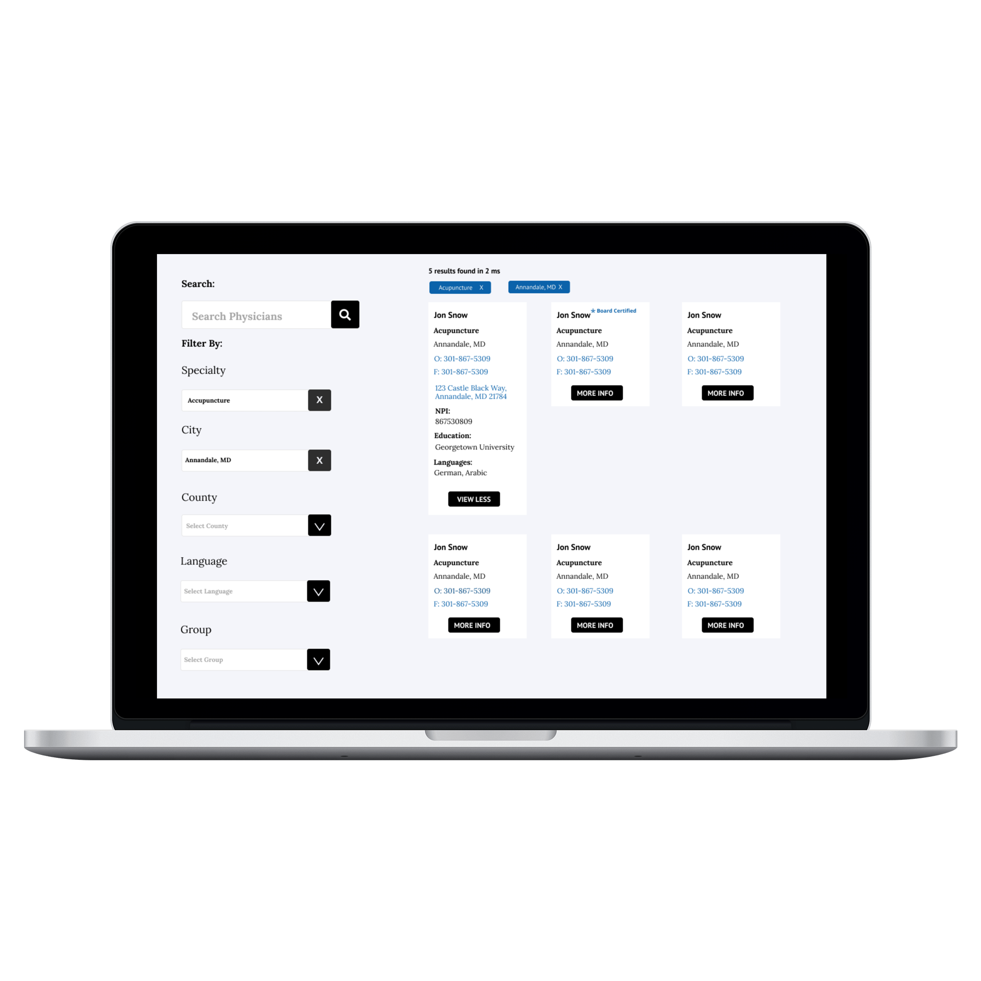
Tags that appear when a filter is selected from the dropdown menu
FINAL FEEDBACK
As we got closer to launching the product and interviewed more physicians, we found a few more places for improvement.
Adding in ad space - In order to drive digital revenue for Washington Custom Media, we needed to put space on the website for ad bidding.
Adding in a copy button - For each search result there is a button in the top right corner of each tile that copies and pastes the information from the result. When the user hovers over the button, they are notified that the button is for copying information.
Adding in a map - This feature gives physicians a visual aid in how far or close a search result is.
Removing dropdown menus, bringing back the checklist for filters - we saw in our second round of testing that time was still being wasted because it would take physicians time to have to scroll through the dropdown menus. We brought back the checklist but also added in a search bar to aid in shortening the list through user input.
THE LAUNCH

Physician’s Directory with new features including the copy/paste button, black star for board certifications, and the option to show the map

Physician’s Directory with the checklist optimized with its own search bar
OPTIMIZING THE MOBILE EXPERIENCE
In our interviews with physicians, they all mentioned using the directory on their desktops. When we inquired about mobile experience, most of them mentioned that they would continue to mainly use the directory on desktop, especially since many times they are simultaneously on the phone. However, in conversations with the office managers and medical secretaries, they did mention a mobile version of the directory could be useful, especially since phones are not a device tied to a desk. With these considerations in mind, we revamped the mobile experience with the same new features as desktop as well as made sure that ad placements were optimized for mobile.

250x300 ad placements for mobile

tiles for search results on mobile
REFLECTION + TAKEAWAYS
This was my first time managing the user research of a product. I was a little nervous but once I began emphasizing my curiosity and desire to solve their challenges, I feel like the doctors tended to be more forthcoming about their pain points.
Since my past projects were often in the education or government industries, I had not had to consider things like ad placements. With this product, where ads were placed was crucial for our sponsors as well as for companies bidding for space on our website. I would take revenue based mindset forward with me on future projects.
THE IMPACT
Reducing time. When looking at site analytics for the average time spent on a page, we found that the average time spent on the search page for the original directory was around 7 minutes. The redesign had users spending around 2 minutes on average.
More functionality that was useful. Small features we added later on like the ability to copy and paste with the touch of a button, the addition of the map, and the visibility of whether or not a physician is board certified, also greatly helped physicians determine if the doctor in their search result was the right person to recommend to their patients.
More users. Our user base jumped from 1,800 users to over 4,200 after the launch.